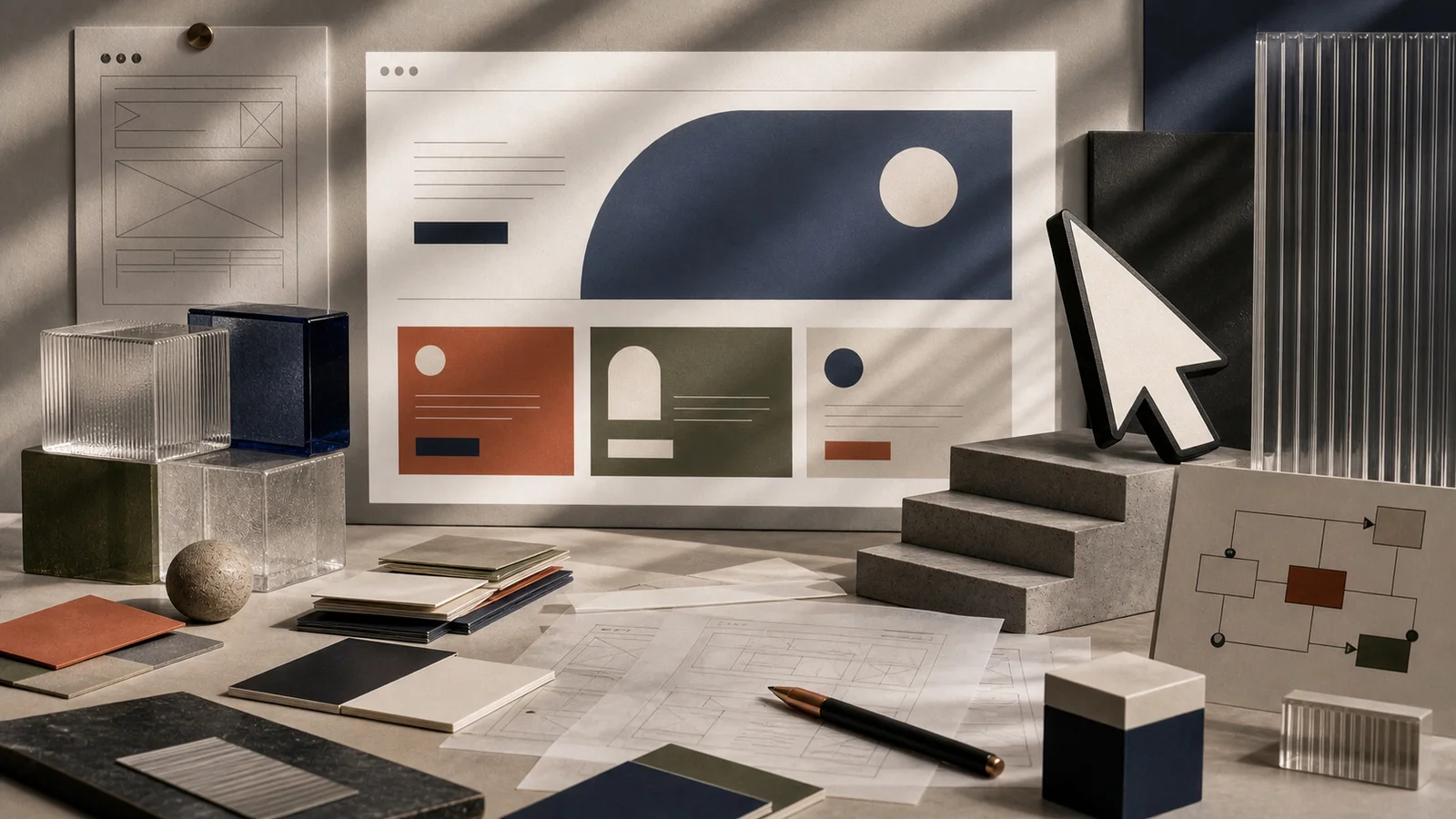
Conversion-focused website design is the practice of arranging a page so a stranger can answer one private question — can I trust this enough to act? — faster than doubt can talk them out of it. It is not button color or clever animation. It is architecture: a structure built to lower the cost of belief at every scroll. Get the sequence right and attention becomes confidence, confidence becomes trust, and trust becomes a call, a form, a booking, a sale.
A website is a building people enter alone.
There is no receptionist to explain the hallway. No salesperson to clarify the offer. No founder standing beside the visitor saying, “Wait, let me show you what matters.” The page must do the work itself. The visitor arrives with attention, suspicion, impatience, and that one private question — and every section either lowers or raises the cost of belief.
The First Room
The first screen of a website is not a billboard. It is an orientation chamber.
In a few seconds, it must answer:
Where am I?
Who is this for?
What can I do here?
Why should I keep going?
What happens next?
Miss any one of these and the visitor does not argue with you — they simply leave, quietly, the way a person backs out of the wrong doorway. A high-converting website answers all five above the fold, in plain language, before the hero image has finished loading. The headline names the promise. The subhead says who it is for. A single primary button shows the next step. Everything else on that first screen is either evidence or exit.
A weak website asks the visitor to believe before it has earned belief. A strong website gives proof in the order doubt appears. That ordering — proof arriving exactly where the question forms — is the whole discipline of conversion-focused web design compressed into a sentence.
What makes a website feel trustworthy?
Credibility is not a feeling visitors summon on their own. They infer it from the room. Design quality, clarity of language, evidence of real work, and the absence of friction all act as proxies for competence — a person cannot inspect your operations, so they read your page as a stand-in for them.
The Stanford Web Credibility Project has long studied what makes websites feel credible. Its practical implication is severe: people judge the legitimacy of an organization partly through the design, usefulness, and evidence of the site in front of them. A typo does not merely look sloppy; it whispers that other things might be sloppy too. A stock photo of a handshake does not merely feel generic; it signals that the specifics are missing.
This is why credibility cannot be added at the end like a coat of paint. It is structural. It lives in real names, real numbers, real faces, real dates — the cartography of trust that lets a stranger locate themselves in your story and decide you are safe to follow.
The Path of Least Anxiety
Conversion is often described as persuasion. That is too aggressive.
A good website does not push the visitor across the room. It removes the furniture blocking the door.
This is where information architecture, visual hierarchy, copy, proof, and performance become one system. The headline sets the promise. The subcopy clarifies. The proof block supports. The service section explains. The call to action makes the next step visible. The contact flow reduces friction. None of these elements persuades alone; they persuade in sequence, each one answering the objection the last one raised.
Clarity -> confidence
Proof   -> trust
Speed   -> patience
Access  -> inclusion
CTA     -> motion
Google’s SEO Starter Guide frames search optimization around making content easier for users and search engines to understand. That same principle governs conversion. If the page is hard to understand, the offer becomes hard to trust — and a page that is easy to understand tends to be the one that ranks and the one that converts. Clarity is the rare investment that pays in both currencies at once.
Nielsen Norman Group’s research on information scent describes how people follow cues — link text, headings, labels — that promise the reward they are hunting for. When the scent is strong, visitors move confidently deeper. When it is faint or misleading, they hesitate, backtrack, and leave. Every navigation label and button is a scent marker. Vague ones (“Learn more,” “Solutions”) thin the trail; specific ones (“See website packages,” “Book a strategy call”) strengthen it.
Why do fast websites convert better?
A slow site does not first feel technically broken. It feels indifferent.
The visitor taps and waits. The screen hesitates. Doubt enters before the brand has spoken. Speed converts because patience is a limited resource and every second of delay spends it. Long before a user can name a performance metric, their body has already registered the friction and started composing an exit.
Google’s Web Vitals give teams a practical language for measuring that experience — loading, responsiveness, and visual stability — and Google has been clear that these signals inform ranking as well as satisfaction. But beneath the metrics is a human truth: delay changes mood, and mood decides whether a stranger extends you the benefit of the doubt. A layout that jumps as images load, a button that ignores the first tap, a hero that arrives a beat late — each is a small betrayal of the visitor’s attention.
This is why The Speed of Belief matters. Performance is part of persuasion because patience is part of trust, and a site that respects the visitor’s time earns the right to ask for it.
Proof Must Have Texture
Most websites make claims. Fewer produce evidence.
Evidence has texture: names, numbers, screenshots, testimonials, before-and-after states, case studies, process details, third-party references, team photos, current dates, and specific outcomes. Generic praise does less than one concrete sentence from a real customer. “They were great to work with” reassures no one; a line like “they rebuilt our booking flow and we finally stopped bleeding revenue to no-shows” does the work of a paragraph.
Texture matters because doubt is specific. A visitor does not distrust you in the abstract — they distrust a particular thing: whether you deliver on time, whether you understand their industry, whether the price is real. Proof earns belief only when it answers the exact worry the visitor is holding. Place a testimonial about deadlines next to the promise about deadlines, not in a carousel three sections away.
The proof section is not decoration. It is testimony. This is the subject of The Proof Machine, but the principle belongs in every website strategy. A page that says “we are trusted” without showing why forces the visitor to supply the trust themselves — and most will not lend what you have not shown you can be trusted with.
Accessible Means Commercially Awake
Accessibility is often treated as compliance. It is more fundamental than that.
The W3C’s Web Content Accessibility Guidelines 2.2 describe recommendations for making web content more perceivable, operable, and understandable. For business owners, accessibility should also be understood as basic hospitality — and as commercial self-interest. If people cannot read the contrast, navigate by keyboard, tap the target, understand the label, or submit the form, the website has failed as a public room, and it has failed a customer who arrived ready to buy.
An inaccessible website is not sophisticated. It is closed to people who arrived. And the same choices that open the door for someone using a screen reader — clear structure, legible type, honest labels, generous tap targets — quietly improve the experience for everyone else, including the harried person checking your site on a cracked phone in bad light.
The Door Must Look Like a Door
The call to action is the door. If it is hidden, vague, or frightening, people wander.
A strong CTA makes the next step feel natural. It says what will happen. It appears where decision energy rises — after the proof, after the objection is answered, not stranded at the very top before trust exists. It does not trick the visitor with fake scarcity or a bait-and-switch label. It respects the visitor’s state of mind. The ritual of the click is a small act of faith, and the design’s job is to make that faith feel warranted.
The website’s job is not merely to be admired. It is to help the right person move. That movement may be a call, form submission, download, booking, purchase, or email signup. Whatever the goal, the architecture must support action without violating trust — because a click extracted by manipulation is a customer lost at the next step.
How to strengthen your website’s architecture this week
You do not need a rebuild to lower the cost of belief. Walk your own homepage as a suspicious stranger and fix the friction in this order:
- Read your first screen out loud. In ten seconds, can a stranger say where they are, who it’s for, and what to do next? If not, rewrite the headline and subhead in plain language before touching anything else.
- Name one primary action per page. Remove or demote competing buttons. Make the primary CTA a specific verb-plus-outcome (“Book a free consultation”), not “Submit” or “Learn more.”
- Move your best proof next to your biggest claim. Find the one worry your customers actually voice, then place a concrete testimonial, number, or screenshot directly beside the promise it answers.
- Test your site on a real phone on a slow connection. Note anything that jumps, lags, or ignores the first tap, and fix the worst offender. Speed is the cheapest trust you can buy back.
- Run a two-minute accessibility pass. Check color contrast, tab through the page with only your keyboard, and confirm every form field has a visible label. Fix whatever blocks someone from finishing.
- Shorten your contact form. Cut every field you do not truly need to make the first contact. Each removed field is furniture pulled away from the door.
Do these six things and you will not have “redesigned” anything. You will have removed the anxieties standing between an interested stranger and the action you both want.
FAQ
What is conversion-focused website design?
It is designing a page so the visitor can decide to act quickly and confidently, rather than designing only for looks. In practice it means sequencing clarity, proof, speed, accessibility, and a clear call to action so each element answers the doubt the previous one raised. The goal is not to pressure anyone — it is to remove the friction between an interested stranger and the next step.
How long should a high-converting homepage be?
Long enough to answer every question a buyer has before they act, and no longer. The right length is set by objections, not word count: a simple, familiar offer may convert on a short page, while a considered purchase needs more proof and explanation. Structure matters more than length — lead with the answer, then let doubt guide the order of the sections.
Does website speed really affect conversions?
Yes. Delay changes a visitor’s mood before your brand has said anything, and doubt tends to fill the wait. Google’s Web Vitals give you a practical way to measure loading, responsiveness, and visual stability, and improving them tends to help both search ranking and the visitor’s willingness to stay. Test your site on a real phone over a slow connection and fix the worst lag first.
Where should the call to action go on a page?
Where decision energy rises — after the promise has been made and the main objection answered, not stranded at the very top before any trust exists. Most pages benefit from one clear primary action repeated at natural decision points as the visitor scrolls. Make it a specific verb and outcome, and make sure it looks unmistakably like a door.
Where to go next
For performance, read The Speed of Belief. For proof and credibility, read The Proof Machine. To turn your site into a clearer sales path, see our Website Development services or our website packages.